
In a world where smartphones are ubiquitous, optimizing your WordPress site for mobile is not just an option—it’s a necessity. A responsive website ensures a seamless experience for users across all devices, which is essential for engaging visitors and improving search engine rankings. Let’s explore how to craft a responsive experience using WordPress.
Selecting a Responsive Theme
The foundation of a mobile-optimized website is a responsive theme. WordPress offers a plethora of themes designed to adapt to various screen sizes and resolutions. When choosing a theme, look for ones that are expressly labeled as “responsive” and test them on different devices to ensure they scale and adjust correctly. Many themes also offer customization options to fine-tune mobile responsiveness further.
Leveraging WordPress Customizer for Mobile Views
The WordPress Customizer is a powerful tool for making real-time adjustments to your site. What’s advantageous about the customizer is its ability to preview changes on different device sizes. You can toggle between desktop, tablet, and mobile views to ensure that your design modifications translate well across all platforms.
Optimizing Images for Fast Loading
High-resolution images can significantly slow down your site on mobile devices. To prevent this, ensure your images are optimized for the web. Use image compression plugins like Smush or ShortPixel to reduce file sizes without losing quality. Additionally, WordPress now supports responsive images natively, so your site will automatically serve scaled images based on the user’s device.
Fine-Tuning Navigation for Touch Screens
Mobile users navigate with taps and swipes, not clicks and scrolls. Thus, your site’s navigation should be designed for touch. 워드프레스 menus should be easily expandable and collapsible, with a clear hierarchy. Consider implementing a hamburger menu for mobile views to save space and maintain usability.
Ensuring Plugin Compatibility
While plugins add functionality to your WordPress site, they can sometimes lead to mobile compatibility issues. Evaluate your plugins to ensure they don’t interfere with your site’s responsive design. Seek out plugins that are mobile-friendly or offer responsive features, and always test their impact on your site’s mobile performance.
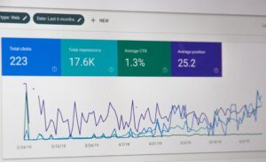
Testing and Improving with Mobile Analytics
Finally, understanding how visitors interact with your site on mobile devices is key to further optimization. Utilize tools like Google Analytics to track mobile usage and identify areas for improvement. Pay attention to metrics like mobile bounce rate and average time on page to gain insights into the mobile user experience.
In summary, a mobile-optimized WordPress site is paramount in today’s digital landscape. By selecting a responsive theme, utilizing the WordPress Customizer, optimizing images, refining navigation, ensuring plugin compatibility, and leveraging mobile analytics, you can create a responsive, mobile-friendly experience that satisfies users and search engines alike. Embrace these techniques to make sure your WordPress site doesn’t just keep up with the mobile revolution—it leads the charge.


