ExplainedCreator StudioSoftware
Colour Correction vs Colour Grading: What Each Editing Step Does
Colour correction makes footage accurate; colour grading gives it a mood. What each step changes, the order to work in, the scopes to read and common mistakes.
4 min read
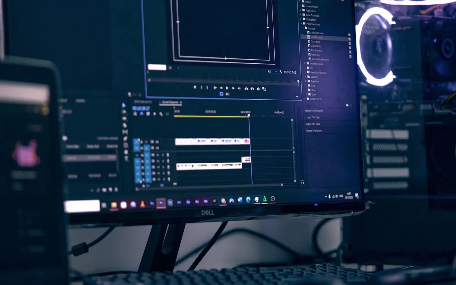
Colour correction makes footage look accurate and consistent. Colour grading gives it a mood. The first is a repair job that answers the question "does this look right?", and the second is a creative decision that answers "how should this feel?". Most editing software spells both the American way, so menus may say color correction and color grading, but the work is the same.
Beginners often treat the two as one slider labelled "make it look nicer". Separating them, and doing them in the right order, is what turns a pile of mismatched clips into a film that feels finished.
The two jobs compared
| Colour correction | Colour grading | |
|---|---|---|
| Goal | Natural, consistent picture | A deliberate look or atmosphere |
| When | First, shot by shot | After correction, often across whole scenes |
| Typical changes | Exposure, white balance, contrast, saturation, shot matching | Tinted shadows, warmer or cooler highlights, muted or boosted colour, film-like contrast |
| Measured by | Scopes and neutral references such as white walls and skin | Taste, story and consistency with the rest of the project |
What correction fixes
Camera settings, changing light and different devices all leave their marks on footage. Correction cleans those up:
- Exposure: brightening a dark clip or pulling back one that is too bright, without losing detail in faces.
- White balance: removing an orange cast from indoor bulbs or a blue cast from shade, so whites look white.
- Contrast: setting a sensible distance between the darkest and brightest parts of the image.
- Saturation: bringing colour to a believable level, neither washed out nor neon.
- Shot matching: making a close-up from one camera sit comfortably next to a wide shot from another.
Plenty of this can be avoided at the shoot. A face lit with matching bulbs, as described in the guide to three-point lighting at home, needs far less rescue than one lit by a window on one side and a warm lamp on the other.
What grading adds
With a clean, consistent base in place, grading shapes how the audience feels. A warm, golden treatment can suggest memory or comfort. Cool blues and greens can add tension. Desaturated, low-contrast pictures often read as sober or documentary-like, while rich colour and deep blacks feel glossy. The skill lies in choosing a look that serves the content and applying it evenly, rather than reaching for a dramatic preset on every clip. Choosing a style is a human judgement in the same way it is in other creative fields, a theme explored in the article on AI, art and machine learning.
Work in this order
- Prepare the screen. Turn off night-mode or blue-light filters, set a moderate brightness and avoid judging colour in a dark room on a phone at full brightness.
- Correct each shot. Fix exposure and white balance first, then contrast and saturation. These are called primary corrections because they affect the whole frame.
- Match shots within each scene. Pick one well-exposed hero shot and bring the others towards it.
- Make secondary corrections. Isolate one colour range or area, for instance a sky that is too pale or skin that looks too red, and adjust only that.
- Grade the look. Apply the creative treatment across scenes so the project feels like one piece.
- Check elsewhere. Watch the export on a television and a phone before calling it finished.
Scopes worth learning
Eyes adapt quickly and are easily fooled by a bright room or a tinted screen. Scopes measure the picture instead:
- Waveform: plots brightness across the frame from left to right. It shows at a glance whether highlights are clipping or shadows are crushed into flat black.
- Vectorscope: shows hue and saturation as a circular plot. Many include a skin tone line; faces of every complexion tend to sit near it when the colour is natural.
- RGB parade: splits red, green and blue into side-by-side graphs, which makes a colour cast obvious.
- Histogram: a simpler count of how many pixels sit at each brightness level.
Lift, gamma and gain
Most colour tools divide the image into three tonal ranges. Lift adjusts the shadows, gamma the midtones and gain the highlights. Each usually comes with a colour wheel, so it is possible to warm the highlights while cooling the shadows. The word gain here has nothing to do with the input level on a microphone, explained in the guide to dynamic and condenser microphones, although both describe turning a signal up.
Mistakes that give beginners away
- Grading before correcting, so the creative look sits on top of a colour cast and turns muddy.
- Pushing saturation until skin turns orange or blotchy.
- Crushing blacks so hair and clothing lose all texture.
- Giving every clip a different look, which makes cuts feel jumpy.
- Correcting a series of interview clips one by one without a reference shot, so the same face changes colour from cut to cut. Consistency across a set matters for stills as well, for example with AI-generated headshots for a whole team.
Common questions
Is colour grading only for films?
No. Short social clips, wedding videos, product demos and video podcasts all benefit from a consistent look, even a gentle one.
Do I need dedicated grading software?
Most editing applications include exposure, white balance, colour wheels and basic scopes. Specialised grading tools add finer control, but the order of work above applies to all of them.
Can automatic colour matching replace manual work?
Auto-match features give a useful starting point, especially for shot matching. They still need checking against the scopes and a human eye on skin tones.
Across the sections
Editor’s picks
 TechnologyAI Headshot Generators: The Fast Track to Professional-Looking Photos3 min
 BusinessEnhancing RAG Systems Through User Feedback2 min
 TechnologyWhat Is a Streaming Stick? A Plain Look at the Plug-In TV Gadget4 min
 BusinessFrom Nigeria to the World: Exploring Citizenship by Investment Programs Abroad3 min
Spotted a mistake?
Suggestions help us plan.
Also explained in Creator Studio
 Creator Studio
 What Is a Jump Cut? J-Cuts, L-Cuts and Other Basic Video Edits
4 min Creator Studio
 What Is B-Roll? Cutaway Footage That Keeps Videos Watchable
4 min Creator Studio
 What Does Royalty-Free Mean? Music for Videos and Podcasts Explained
4 min Creator Studio
 Three-Point Lighting for Video Calls: Key, Fill and Back Light at Home
5 min Creator Studio
 Dynamic vs Condenser Microphone: Choosing and Setting Up a Podcast Mic
5 min Creator Studio
 What Is Frame Rate? 24, 30 and 60 fps for Video Made Clear
5 min